2024. 6. 17. 01:19ㆍFlutter/Flutter Programming
플러터에서 CustomScrollView는 ListView나 GridView와 같은 기본 스크롤 위젯보다 더욱 유연하고 사용자 정의 가능한 스크롤 동작을 구현할 수 있도록 하는 강력한 위젯입니다.
Sliver라는 위젯 구조를 사용하여 다양한 종류의 콘텐츠를 효율적으로 표시하고, 헤더, 푸터, 고정된 요소 등을 자유롭게 추가할 수 있습니다.
이 블로그에서는 CustomScrollView의 기본 사용법부터 다양한 옵션과 속성, 실제 개발에 활용할 수 있는 실용적인 예제까지 심층적으로 알아봅니다.
1. CustomScrollView 기본 사용법
CustomScrollView를 사용하려면 다음과 같은 형식으로 위젯을 생성해야 합니다.
CustomScrollView(
  slivers: [
    // Sliver 위젯들을 리스트 형태로 추가합니다.
    SliverAppBar(
      title: Text('CustomScrollView 예제'),
    ),
    SliverList(
      delegate: SliverChildListDelegate(
        children: [
          Text('Item 1'),
          Text('Item 2'),
          // ...
        ],
      ),
    ),
    SliverFixedExtentList(
      delegate: SliverChildListDelegate(
        children: [
          Container(
            height: 100,
            color: Colors.red,
          ),
          Container(
            height: 100,
            color: Colors.green,
          ),
          // ...
        ],
      ),
      itemExtent: 100,
    ),
  ],
)
- slivers: Sliver 위젯들을 리스트 형태로 추가하는 속성입니다. 여러 개의 Sliver 위젯을 조합하여 원하는 스크롤 동작을 만들 수 있습니다.
- SliverAppBar: 목록 위에 헤더를 추가합니다.
- SliverList: 기본적인 목록을 표시합니다.
- SliverFixedExtentList: 모든 아이템의 높이가 일정한 경우 성능을 최적화하기 위해 사용합니다.
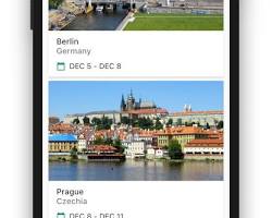
예시
위 코드는 다음과 같은 화면을 만들 것입니다.
2. CustomScrollView 옵션
CustomScrollView에는 다양한 옵션들이 제공됩니다. 대표적인 옵션들과 간단한 설명은 다음과 같습니다.
- scrollDirection: 스크롤 방향을 설정합니다. 기본값은 Axis.vertical이며, Axis.horizontal 로 설정하면 가로 방향으로 스크롤되는 CustomScrollView를 만들 수 있습니다.
- physics: 스크롤 방식을 설정합니다. 기본값은 AlwaysScrollableScrollPhysics이며, BouncingScrollPhysics 를 설정하면 CustomScrollView 끝에서 반동 효과를 적용할 수 있습니다.
- reverse: 아이템 목록의 순서를 반전할지 여부를 설정합니다. 기본값은 false이며, true 로 설정하면 마지막 아이템부터 첫 번째 아이템까지 순서대로 표시됩니다.
- padding: CustomScrollView의 패딩을 설정합니다.
- primary: 기본 스크롤 위젯으로 설정할지 여부를 설정합니다. 기본값은 true이며, false 로 설정하면 다른 스크롤 위젯과 함께 사용할 수 있습니다.
- controller: ScrollController를 사용하여 스크롤을 직접 제어할 수 있도록 합니다.
3. 실제 개발 예제
다음은 실제 개발에서 활용할 수 있는 CustomScrollView 사용 예제입니다.
1. 헤더와 목록을 함께 사용하기
CustomScrollView(
  slivers: [
    SliverAppBar(
      title: Text('CustomScrollView 예제'),
    ),
    SliverList(
      delegate: SliverChildBuilderDelegate(
        (context, index) {
          return ListTile(
            title: Text('Item $index'),
          );
        },
        childCount: 100,
      ),
    ),
  ],
)
설명
- 위 코드는 SliverAppBar 위에 SliverList를 배치하여 헤더와 목록을 함께 표시합니다.
- SliverChildBuilderDelegate를 사용하여 동적으로 ListTile 위젯을 생성합니다.
2. 고정된 요소 추가하기
CustomScrollView(
  slivers: [
    SliverAppBar(
      title: Text('CustomScrollView 예제'),
    ),
    SliverList(
      delegate: SliverChildBuilderDelegate(
        (context, index) {
          return Text('Item $index');
        },
        childCount: 100,
      ),
    ),
    SliverSliverListDelegate(
      delegate: SliverChildListDelegate(
        [
          Container(
            height: 50,
            color: Colors.red,
            child: Text('고정된 요소'),
          ),
        ],
      ),
      sliverLayoutBuilder: (context, sliverState, childCount, sliverHeight) {
        return SliverPositionedSliver(
          sliver: child,
          position: 0.0,
        );
      },
    ),
  ],
)
설명
- 위 코드는 SliverList 아래에 SliverSliverListDelegate를 사용하여 고정된 요소를 추가합니다.
- sliverLayoutBuilder 함수를 사용하여 고정된 요소의 위치를 설정합니다.
- SliverPositionedSliver 위젯을 사용하여 고정된 요소를 원하는 위치에 배치합니다.
3. 여러 개의 고정된 요소 추가하기
CustomScrollView(
  slivers: [
    SliverAppBar(
      title: Text('CustomScrollView 예제'),
    ),
    SliverList(
      delegate: SliverChildBuilderDelegate(
        (context, index) {
          return Text('Item $index');
        },
        childCount: 100,
      ),
    ),
    SliverSliverListDelegate(
      delegate: SliverChildListDelegate(
        [
          Container(
            height: 50,
            color: Colors.red,
            child: Text('고정된 요소 1'),
          ),
          Container(
            height: 50,
            color: Colors.blue,
            child: Text('고정된 요소 2'),
          ),
        ],
      ),
      sliverLayoutBuilder: (context, sliverState, childCount, sliverHeight) {
        final firstSliverHeight = sliverState.layoutSize.childCount > 0 ?
          sliverState.layoutSize.firstChildHeight : 0.0;
        return SliverOverlapAbsorber(
          sliver: SliverList(
            delegate: SliverChildListDelegate(
              [
                Container(
                  height: firstSliverHeight,
                  color: Colors.transparent,
                ),
              ],
            ),
          ),
          overlapChild: SliverStack(
            sliverList: [
              SliverPositionedSliver(
                sliver: Container(
                  height: 50,
                  color: Colors.red,
                  child: Text('고정된 요소 1'),
                ),
                position: 0.0,
              ),
              SliverPositionedSliver(
                sliver: Container(
                  height: 50,
                  color: Colors.blue,
                  child: Text('고정된 요소 2'),
                ),
                position: firstSliverHeight,
              ),
            ],
          ),
        );
      },
    ),
  ],
)
설명
- 위 코드는 SliverList 아래에 SliverSliverListDelegate를 사용하여 두 개의 고정된 요소를 추가합니다.
- SliverOverlapAbsorber와 SliverStack 위젯을 사용하여 고정된 요소가 다른 콘텐츠와 중첩되는 것을 방지합니다.
4. 더 알아보기
플러터 CustomScrollView는 다양한 옵션과 속성을 제공하며, 상황에 맞게 활용하면 더욱 유연하고 사용자 정의 가능한 스크롤 동작을 구현할 수 있습니다.
- 'NestedScrollView' 와 함께 사용하기: 더욱 복잡한 스크롤 구조를 만들 때 사용합니다. NestedScrollView는 CustomScrollView와 다른 스크롤 위젯을 결합하여 사용할 수 있도록 합니다.
- 기타 옵션: cacheExtent, padding, controller 등 다양한 옵션을 사용하여 CustomScrollView를 더욱 효율적으로 사용할 수 있습니다.
- 성능 최적화: SliverFixedExtentList, SliverOverlapAbsorber 등을 사용하여 성능을 최적화할 수 있습니다.
5. 마무리
플러터 CustomScrollView는 기본 스크롤 위젯보다 더욱 강력하고 유연한 스크롤 동작을 구현할 수 있는 도구입니다. 다양한 옵션과 속성을 활용하여 상황에 맞게 사용하면 원하는 디자인과 기능을 만족하는 스크롤 UI를 만들 수 있을 것입니다.
이 블로그에서 다룬 내용을 잘 이해하고 실제 개발에 적용한다면 플러터에서 더욱 효과적이고 사용자 친화적인 스크롤 경험을 제공할 수 있을 것입니다.
수발가족을 위한 일기장 “나비일기장”
https://play.google.com/store/apps/details?id=com.maccrey.navi_diary_release
구글플레이 앱 배포의 시작! 비공개테스트 20명의 테스터모집을 위한 앱 "테스터 쉐어"
https://play.google.com/store/apps/details?id=com.maccrey.tester_share_release
Tester Share [테스터쉐어] - Google Play 앱
Tester Share로 Google Play 앱 등록을 단순화하세요.
play.google.com
카카오톡 오픈 채팅방

'Flutter > Flutter Programming' 카테고리의 다른 글
| 플러터에서 앱 상태에 대한 대응 방법: 핵심 전략 이해하기 (0) | 2024.06.18 |
|---|---|
| 플러터에서 Scaffold 생명주기: 핵심 단계 이해하기 (0) | 2024.06.18 |
| 플러터에서 GridView 사용법과 옵션 가이드 (0) | 2024.06.17 |
| 플러터에서 SliverList 사용법과 옵션 가이드 (1) | 2024.06.17 |
| 플러터에서 ListView.builder 사용법과 옵션 가이드 (1) | 2024.06.17 |